Data visualization, the front end of data analysis that makes everything more understandable, interactive, and attractive, is taking off like never before. Many companies have risen to helping establish accessible data tools that are both easy to operate, and understand to where anyone today can point the tool at a data sent in particular and begin developing dashboards, and charts like never before.
However, democratizing data analysis and working towards creating self-service BI can have very negative implications if the discipline and rigor behind that data analysis isn’t handled along with developing all those great dashboards. Furthermore, you can easily find yourself building interesting charts without being able to articulate why those charts are impactful, and what knowledge you’d need to back up if something irregular pops up that someone calls out in a meeting.
People would agree, for the most part, you shouldn’t take someone off the street that isn’t an engineer and have them design & build an airplane. Even if the tools to design an airplane become accessible, engineering is important to make sure the plane flies successfully when it’s actually constructed and launched.
The same should be true for data, though most data isn’t related to life or death situations, there is data misused or incorrectly calculated that can bring a company to it’s knees – from bad sales figures, to bad market analysis resulting in tweets that spin the company into damage control.
With that in mind, I have 3 steps to make your data visualizations more accurate and useful, so your understanding of data can go hand in hand with your energy to leverage it.
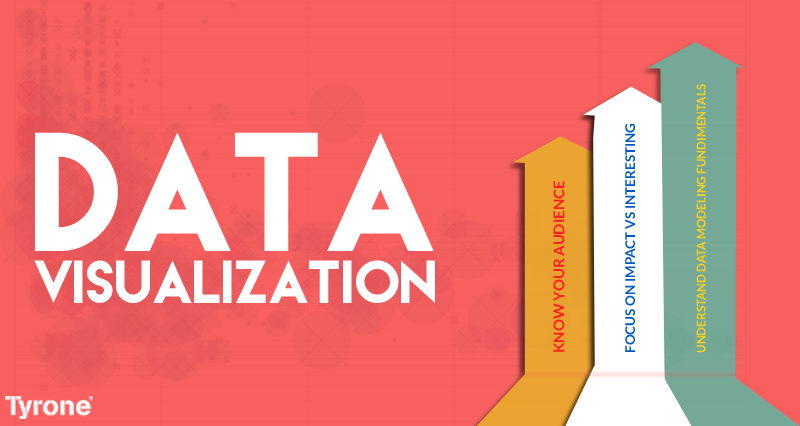
1. Understand Data Modeling Fundimentals
This may sound / seem like overkill, but if you’re going to work with a tool like Tableau or Qlikview, having the basics down around how data works and how to model it effectively means you can go into some data source somewhere, understand it down to the elements themselves, and join that data together in a way that allows for meaningful and accurate analytics.
If you don’t know what an inner vs outer join is, then you’ll have a hard time even pulling together the data into a tool like Tableau without potentially impacting the outcome.
It’s a hard thing to get through, especially if you want to stay out of the weeds of data management, but it’ll get you deep enough in the fundamentals around good data governance and management, that you’ll be far more effective at building compelling and accurate data models.
2. Focus on Impact vs Interesting
The world is full of interesting data, that would make for all kinds of interesting conversations. However, very little of that translates into impactful data that can make a material impact on a company’s bottom line. Knowing what’s interesting vs impactful can make the difference between a bunch of nice looking visualizations, vs an impacting dashboard that drives business change and makes what you’re doing both useful and practical.
There are a lot of books out there that show examples of data visualization, and the majority are certainly interesting and informative. However, if they don’t have a direct impact on helping change your business in some way, then you might as well frame and hang those pictures on a wall. Develop a clear hypothesis, know what you’re looking to get from the data, and work the problem through to a conclusion.
Data journalism is a great approach towards this, that combines story telling with a clear impact, call to action, or outcome.
3. Know your audience
The most important step in making data visualization useful is to know your audience, and tailor the output in a way that makes it the most useful for the consumer. A CFO typically won’t want to see the same visualization as a CMO, and with the majority of data visualization tools allowing for the ability to filter / slice / drill based on the data available in a cube, you can tailor content like never before and peform ad-hoc data analysis with less construction up front required.
Understand what questions your audience might ask ahead of time, and consider how your material is fluid enough to respond in turn. You might be building a dashboard for showing sales nationwide for your company, but what if they ask for one product vs another? Can you build your data model to support that, then add a filter or will you have to go back, work for a week, and bring the specific chart back?
There’s tons of great data points out there, waiting to be discovered and shared via data visualization platforms to help enhance and enlighten business users at all levels of the organization. Make sure though, before jumping into the fray, that you have the foundation, direction, and foresight to develop something meaningful.